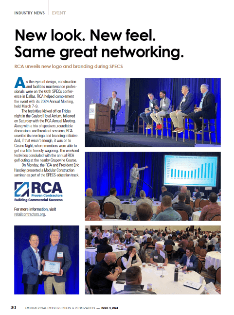

 The ease and convenience of online retail purchasing, coupled with revitalized downtown city centers offering a walkable boutique shopping experience, has made the traditional shopping mall virtually obsolete. Many city and suburban landscapes are dotted with vacant malls surrounded by a sea of empty asphalt parking spaces. While some stand-alone “big box” stores are finding a second life as outpatient healthcare centers, many larger multi-tenant malls are having a more difficult time reinventing themselves.
The recent transformation of The Hill Shopping Center, a mid-century modern facility built in Dallas in 1977, is the perfect blueprint for revitalizing underutilized and abandoned retail shopping centers.
Offering more than 236,000 square feet of retail and office space, the Hill’s proximity to Dallas’ most affluent neighborhoods to the west, and the growing millennial population further east and south, as well as the 9 to 5 workforce pedestrian traffic, made it an attractive property for renovation.
Cypress Developers, inspired by recently opened and successful pedestrian malls in other downtown city locations, wanted to create a unique retail destination experience at The Hill. Members of the project team partnered to collaborate on the early concept and schematic design to help reinvent the aging complex to meet the growing demand for retail and restaurant experiences that provide a community “sense of place.”
One of the primary design goals in repositioning the shopping mall was to create a retail environment that did not feel like a traditional mall.
One of the first decisions they faced was to ascertain the financial viability of the project and determine the level of investment the property required. The outdated retail center featured weathered brown brick buildings with radius corners and nautical windows. The design made it difficult for tenants to project individual brand visibility. The Hill had clearly outlived its current incarnation, yet the configuration of indoor and outdoor spaces anchored by an interior courtyard offering a shady oasis under the canopy of mature oak trees inspired a potential second act.
The project team’s vision was to revive and elevate the development by embracing an authentic, cutting-edge yet preservation-minded approach with a strong emphasis on sustainability that maintained the integrity of the 1970s architecture. They sought to transform the outdated space by implementing design strategies that would create a walkable, visitor-friendly sequence of proprietor-driven shops and restaurants with a decidedly “un-mall” feel.
Their vision focused on three key renovation strategies: Incorporate “AH HA” Design Elements, Preserve and Enhance VS Demolish and Replace, and Focus on Tenant Brand Identity.
No. 1 — Incorporate “Ah Ha” Design Elements
To help keep a visually arresting destination, designers focused on façade material selection, incorporating local artwork and murals and created zoned color palettes to enhance the development’s visual identity. The goal was to make each tenant feel like an independent storefront by giving each its own distinctive look and feel within The Hill.
By varying heights and incorporating rainscreens onto roof and façade designs, the overall expression creates interest and intrigue around every corner, encouraging visitors to continue moving throughout the site and discover their next “ah ha” moment.
Visitors still can see original brickwork and appreciate the center’s history and architectural past while enjoying its new vibrancy and transformation.
The design team also integrated multiple, interconnected grade changes across the site, creating an easily accessible experience. Special attention was given to ensuring there were no “dead zones” or spaces that were not interlinked to the rest of the development. Careful massing and attention to sight lines provide glimpses into the corridors and alleyways that lead pedestrians to the inner shaded courtyard.
Another visual element that differentiated this project from the local retail competition was the integration of artwork. The team worked with 10-plus different local artists whose work is displayed throughout the space. In some areas where waterproofing was exposed, several artists were commissioned to paint murals. These not only created aesthetic appeal, but also helped diversify the building materials chosen to optimize cost and value, such as cement fiber and ribbed metal panels. In this project, metal panels were creatively combined with fire-treated cedar and cost effective cor-10 panels in a way that created interest and did not look inexpensive.
No. 2 — Preserve and Enhance vs Demolish and Replace
In order to be financially viable, the design team was challenged to reimagine and change the perception of what was basically a hodge-podge collection of unappealing brown brick buildings. The budget did not allow the buildings to be demolished and replaced. The ideal became how to make each building into its own work of art—on a challenging budget.
The design team developed a cost-effective solution—use the façades of the existing buildings as an underlying canvas, and then add layers of new materials, rain screens, new storefronts, canopies and signage to create visually appealing neighborhoods that would draw visitors throughout the campus and into the center courtyard.
Because one of the primary goals and an integral part of the project’s vision was preservation and sustainability, the design solution did not cover up the old façades, rather considerable effort was focused on how to attach the new layers to the old skin. The goal was not to destroy, but enhance. Visitors still can see original brickwork and appreciate the center’s history and architectural past while enjoying its new vibrancy and transformation.
Examining all the possibilities in advance and setting reasonable boundaries provided a good balance of creativity and standardization.
In some cases, these layers also had practical value. Rain screens, for example, were used in layers to help maintain the building, protect it with waterproofing and enhance façades.
The most significant challenge was convincing the construction team that the layering approach could be implemented. Much of the construction had to be handcrafted—nothing was “off the shelf.” 3-D modeling helped bring the designs to life, facilitating a true collaboration between the design team and construction field team.
No. 3 — Focus on Tenant Brand Identity
One of the primary design goals in repositioning the shopping mall was to create a retail environment that did not feel like a traditional mall. The key was to customize each tenant’s storefront to help it stand out from the crowd. This is the opposite of how shopping malls are designed and required the architects to preplan how the buildings could be “broken up” to appear as individualized storefronts. The developer’s challenge was anticipating the unknown, as Cypress needed to be flexible so tenants could customize their individual units, while adhering to and complementing the overall site continuity.
Because signage and company logos are critical identifiers and an important means of differentiation, the design team needed a way to allow tenants to incorporate their unique corporate branding on the signage, but within guidelines that ensured a degree of site-wide consistency.
The project team’s vision was to revive and elevate the development by embracing an authentic, cutting-edge yet preservation-minded approach with a strong emphasis on sustainability that maintained the integrity of the 1970s architecture.
The original plan was to develop custom storefronts using wood, aluminum, steel and bronze in different colors and/or designs. But high construction and fabrication costs required an alternate approach to achieve a similar semi-custom, look but within a reasonable budget.
The signage key became less about design, and more about how to convince retailers, owners and tenants that their signage could complement the developer’s vision of a “un mall.” To facilitate tenant buy in, the design team created a “Tenant Signage Guideline” manual. The guide clearly identified the vision of the revitalized complex and signage design parameters, and three to four options for the signage location. Every tenant space was assigned a zone with a color palette, so that not all signs would look the same.
Each tenant presented their signage concept for approval by the design team. Different types and colors of aluminum were used for each storefront (door pulls and handles), allowing each tenant to reflect their own identity. Examining all the possibilities in advance and setting reasonable boundaries provided a good balance of creativity and standardization.
The new “must visit” foodie and retail destination
Seeing an available opportunity, Cypress Developers created something so unique that it is implementing a marketing tagline called, “A retail center that Dallas didn’t know it needed.” The project’s conscientious design approach resulted in a destination development whose unique features and fresh optics stand out in a crowded and evolving retail market.
Many of the design features were customized as the tenant roster was confirmed. At the end of design and construction, many leases were with restaurants. The tenants are mostly restaurants offering health-conscious, local, sustainable offerings and the trend is toward mostly outdoor dining experiences.
_________________________________________________________
Frank Ricks is a founding principal of LRK and oversees complex design and planning projects across the country, focusing on projects that require strong leadership in design and process of delivery. He can be reached at fricks@lrk.com.
Craig Henry brings more than 20 years of design experience to his role as director of LRK’s Dallas office. He has completed a number of award-winning projects of varying types and sizes, including multifamily residential, civic, education and corporate. Henry can be reached at chenry@lrk.com.


 The 2024 virtual Men’s Round Table will be held Q4, 2024, date TBD.